
CARNEGIE
CENTRE
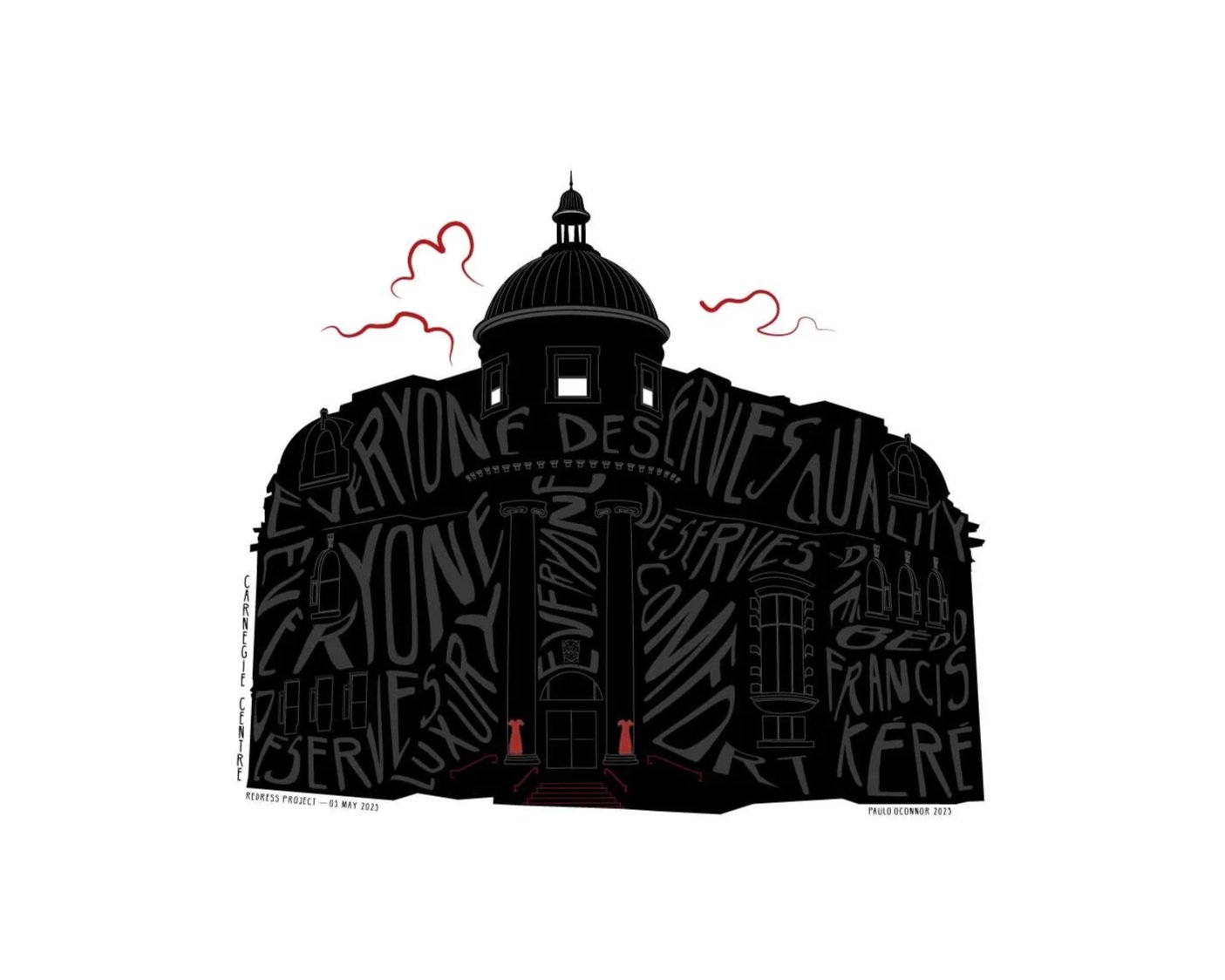
REDress Project, Special Edition
The Carnegie Centre has served Vancouver since 1903. One of 2,500 community libraries built to encourage free access to knowledge as a common civic value, this ICON defines the heart of a city reconciling with Canada’s aboriginal peoples. In 1980 a heritage-aware restoration led to its current life as the “living room” of Vancouver's Downtown Eastside. In 2022 two red dresses were painted on the front columns. The REDress Project by visual artist Jamie Black is an aesthetic response to the 1000+ missing and murdered indigenous women and girls in Canada. This installation art has spread across Canada and the USA. I created this special edition in honour of REDress Day 05 May 2023, to gift to Vancouver’s Downtown Eastside Womens Centre to fundraise for essential programs. The DEWC promotes societal value for and self-value amongst our City’s marginalised and vulnerable women
-
Hand-Drawn Typographic Vector Illustration
Hand-signed and Numbered Gicleé Archival Printing100% of proceeds from Artist Proof to Downtown Eastside Women’s Centre
75% of proceeds of numbered prints to Women’s Centre Safe Space
CAD 1500.00 / Special Edition Limited to 10
16 x 20 in / 41 x 51 cm
-
Each ICON sprouts in my photography. An ICON is approximately two years of process — from concept to completion
I carefully draw out a graphic silhouette by hand. After detailed study I choose which adornments to include — taking particular interest in ones that can be missed by a passerby on the street
Next I extrude elements from the building’s “face”. This period in process feels like an extended ballroom dance. There are twists, turns and dips — I go back and forth, and back again. I aim to leave plenty of space for the typography — which I consider the entry point for a viewer — and still include enough of each ICON’s definitive decorative elements. I’m humbled when viewers recall a personal dialogue or history with an ICON. To allow for this, I’m compelled to ensure familiarity
I select a quote after boulevards of research. I learn from this meditative and often lengthy time in process. Ultimately my choice offers an emergent playfulness between the quote, or the quoted, and what each ICON outwardly presents — rather than be a quote about the ICON itself. Sometimes it complements, sometimes it counters. Sometimes in humour. Sometimes in critiqueEach letter in each composition is unique — hand manipulated as a self fashioned typography. For colour I departed from the blue I used exclusively for the limited edition — to a faded black for impact. The three hints of clouds are a unifying feature across this ICONS series. I use their placement to convey the perceived presence of each ICON relative to a viewer from the streetscape
-
I created my ICON Carnegie Centre with intention, to bring architectural attention to Vancouver’s most economically disadvantaged community. I would offer any Vancouverite to take a slow walk…the architecture of Hastings, Cordova, Princess, Pender, Powell, and Hawks streets will reveal as much about us as an outward looking nation, as any Canadian city can
I’ve made two versions of my Carnegie
My second version here, black on black, highlights the red dresses muralled at the base of each of the portico columns in 2022. I produced this second version in a highly limited series of 10Two framed copies (No’s 1 and 2 of 10) have been donated to the Downtown Eastside Women’s Centre of Vancouver for their 2024 fundraising gala, HERstory. 75% of proceeds from my own sales of this version are also donated to the Women’s Centre.